Build up your portfolio
Miranda Cantrell/Iowa State Daily
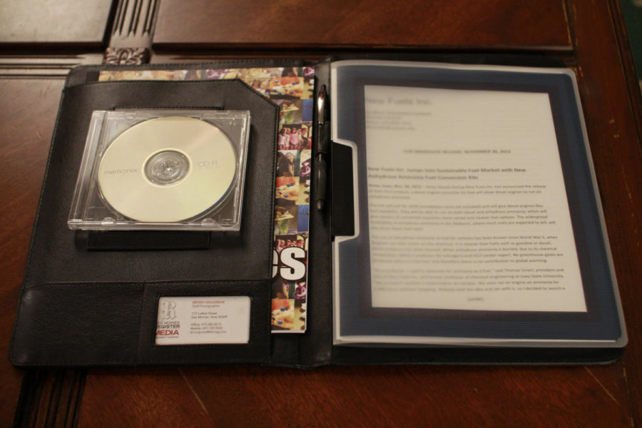
Choosing the right materials for your portfolio can make it stand out. In this day and age, doing both a binder portfolio and digital portfolio is a good idea.
September 18, 2013
A well-thought out resume will get your foot in the door with a potential employer but having a solid portfolio will reinforce your experience and skills.
Format
The first thing you need to do is decide the format of your portfolio. Do you want it in a binder or online? If you decide to put it in a binder, Itoya portfolios are a good choice. They have a clean, classy look and are available in different sizes from 8.5-by-11 inches to 11-by-17 inches. They are free from acid, PVC and lignin, and they are archival safe. The University Book Store in the Memorial Union carries these portfolios in the art section.
If you have decided to do an online portfolio, either on its own or in addition to your binder portfolio, there are many websites to choose from to set them up. Using PowerPoint and putting your portfolio on a CD works as well. One of the most common sites to use to build an online portfolio is WordPress.
Content
The first page of your portfolio should contain your table of contents. No matter which medium you use for your portfolio, you want to make sure that it’s easy to navigate through. The next items should be a short statement of your personal background and your resume. Make sure to include your social media contact information, which may already be included on your resume.
Employers don’t want to see everything you have ever done, but they do want to see some of your best work. Sort through your work samples and pick out 10 to 15 pieces that are either your best work or favorite pieces. For example, if there is a piece of work you’re proud of or had a good time working on, include it. Use only final, finished products that are relevant to the position you’re applying for. Including syllabusi from relevant classes will show the employer what you’ve learned.
Design
The design of your portfolio is strictly up to you because it should reflect your personality, but in a professional way. Make sure it is clean, appropriate and displays your work in an eye-catching manner. Do not be afraid to use a little color in your background, but don’t go overboard. Take the time to layout or arrange your different pieces of work so that they reflect the most relevant first.
If a piece needs to be explained or there is any information that needs to go with it, place it on a facing page. Whichever font you choose needs to be easy to read and keeping it at an 11- or 12-point font is your best bet. If you need to take up some space, using double-spacing is a good way to do that and it might even help your potential employer glance through things easier.
Critiquing
Any time you get the opportunity to have a professional critique your portfolio, do it. They can provide valuable feedback and give you a few pointers others haven’t. It is also a good idea to have your peers critique it, too. As always, check for errors in your spelling and grammar.
Updating
Keep your portfolio up to date at all times. Once you’ve built it in the first place, removing and adding things shouldn’t take too long or be too much of a task. Each time you update it, have it critiqued again. In fact, you could even ask someone if a piece you’re thinking of adding to your portfolio is a good idea before you do so.


