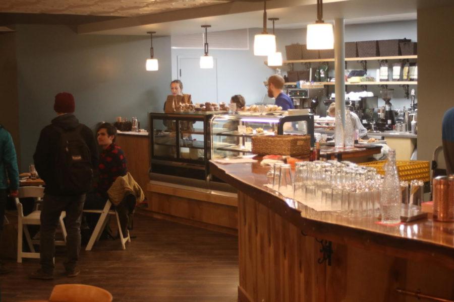
Felker: New-age interior design is uncozy, unseemly
January 29, 2017
As anybody in the restaurant industry could substantiate, there are just as many profits to be won or lost in interior decorating as there are in the actual preparation of any food or drink, the service, the pricing, the advertising or the restaurant’s location.
With very few exceptions, in very few cases and even fewer locales, a restaurant must be cozy.
After having visited a few cafes, restaurants, eateries and drinkeries in Ames with this “new-age,” industrial, interior motif and decoration — or, rather lack of decoration — I felt the need to express some thoughts on this subject, which has been weighing down my conscious.
First: However inconveniencing, a coffee house of any pretensions must have rugs. This same aphorism holds true, albeit to a lesser degree, for other eateries.
Coziness cannot be achieved without textile. Carpet, rug, tapestry, drapery — they offset the cooling nature in hard woods, tiling, glass, bare metals and brick, and all the other “hip” and trendy surfaces many of these new-age establishments favor. They provide a certain feeling of hominess often absent in our cold, unforgiving world, and to ignore them in the designing of a restaurant’s interior is downright ignoble.
This so-called industrial design motif, featured in many fashionable, young people-minded restaurants (think Chipotle or Fuzzy’s Taco Shop) has gone on long enough. The bareness of it is painfully discouraging; oftentimes uncomfortable to the point of repugnance. It is a trend, of course, and will pass, just as the miserable, impractical, minimalist furniture of the early 2000s has since passed away into a forgotten obscurity.
What bothers me the most are the chairs these places go in for. I visit a restaurant, or, for example, a coffee house, to sit and enjoy myself and be comfortable. And when, for example, I am confronted by a fleet of cheap, cold, uncomfortable, unseemly, industrial matte black chairs that are as pleasing to sit in as the wiry, plastic-coated metal benches in front of the Thielen Student Health Center, then I am put off and put away. I don’t want to spend time in a place like this.
The bare steel, the minimalist wall décor, the unfinished ceilings — these design choices, which are oh-so-regrettably common in establishments nowadays, all combine for a utilitarian atmosphere. Like the restaurant wants nothing more than to shuffle its customers through the door, through the line, through the table and through their food like a mass of hogs ran by a trough. Maybe that is all it really wants.
I can understand why the whole deal is so popular. In keeping with the sleek design of current electronics, and, in keeping with the clean, sharp, fashionable lines many of the young generation aesthetically prefer — or, that these designers think they prefer — they have tried to replicate this attraction in their interior spaces; spurred on by the easy maintenance packed alongside the lack of textile. Many of these places could be practically hosed off and bleached at the end of each day, like a factory floor or dive bar.
It’s no wonder why some coffee houses or restaurants are so much more successful than many of their competitors. It is often because of their interiors. The best coffee house will be a warm, colorful, fuzzy place. There will be bookcases, carpets, vases, paintings, eccentrically mixed chairs and tables and a diversity of surfaces, materials and textures.
Instead, many of the cafés and restaurants of today feature an atmosphere of cold, shiny, clean modern industry. I am sick of it, and sick of the degradation it has caused on behalf of self-respecting interior designers everywhere, and common decency.


