The Fashion Show rebrand launch
November 2, 2018
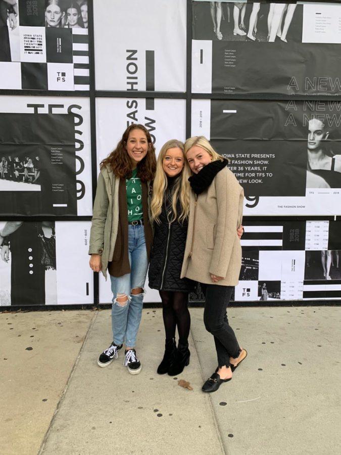
Though it was a chilly early Friday morning outside the front of Parks Library, smiles could be seen on Fashion Show members’ faces with the feeling of a new beginning on the horizon.
“We’ve been out here since seven o’clock this morning,” said Maddie Darvenue, the Fashion Show PR Director. “It’s a beautiful wall put together by our creative directors and our art directors with a fresh brand for the entire campus to see.”
This is the first time in over 30 years that the Fashion Show has rebranded their logo and show. From a whimsical logo to a simple, modern and timeless design, the logo symbolizes a reinvention for the meaning of the Fashion Show.
Since the early 1980s, the Fashion Show has grown exponentially. From a small show inside a classroom in Lebaron Hall, to a sold out show in Stephen’s Auditorium, the Fashion Show has made large strides year by year. In past years, the Fashion Show has also landed large guest designers. Among those are Todd Snyder, Abasi Rosborough and even Patagonia.
The Fashion Show is also known as one of the largest known student-run fashion shows in the country. Each year this attracts many new recruits to the apparel, merchandising and design program, which is now the No. 2 merchandising public school in the nation, according to FashionSchools.org.
With all of this growth over the years, Fashion Show members decided the logo needed a new look that would be a timeless design that would go with each year’s new unique Fashion Show theme. In past years, the Fashion Show has struggled to incorporate the old logo with new themes. So, Fashion Show members welcomed the idea of a new design.
The new design was made by the Fashion Show’s two-year running creative director, Ellen Titman.
“When creating this new logo, I wanted it to be as transparent as possible,” Titman said. “The fashion show is such an iconic organization, not only on Iowa State’s campus, but across the nation and I wanted it to be recognizable for what TFS stands for.”
According to Titman, the geometric element that is shown throughout the design logotype represents (represents what?) and the square element that is in the secondary mark stands for the shape and form of the stage of the Fashion Show.
“Thinking about how and where this new logo is used I wanted it to best represent the show,” Titman said. “The new logo in itself is very modern and sophisticated, as is the show. The purpose behind TFS is to showcase the designers clothing and garments so the new logo is able to compliment rather than distract.”
As a launch for the new branding, Titman created a massive wall of the front side of Parks Library to show all of campus. -reword or explain this better?
“We are finally having a rebrand launch for the fashion show,” Titman said. “So it’s a really exciting day and I’ve come up with a new logo to share with campus and it kind of sets the tone for the rest of the years following.”
Students were able to come and get new buttons and stickers that had the new logo for the Fashion Show on them.