Tetmeyer: The real problem with the M&M change
Columnist Grant Tetmeyer discusses the real issue behind the redesign of the popular M&M candy characters.
January 25, 2022
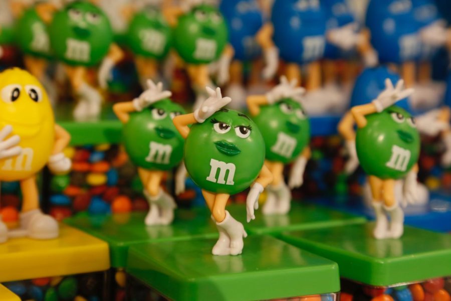
The new changes to the design of the famous M&M characters have become a highly contested issue. The company has released a redesign of all of its mascots to represent a more “dynamic, progressive world.” They are trying to make the characters more relatable by changing how they interact with each other in their marketing, as well as trying to take the focus off of its characters’ genders. While this seems like a great step, it has sparked discourse across the country.
Not only is this another example of just how badly our country is divided, but it also exposed another glaring issue: How many people want to have sex with a spherical candy person who has the same anatomy as Mike Wazowski?
I know that’s a bit much, but how much of M&M’s branding focused on making the characters sexy? I know sex sells. I know that rule 34 has no exceptions, but I really wanted this to be the exception. The fact that a green piece of cartoon candy is causing outcry because it lost its sex appeal is just disturbing. I don’t think I will be able to look at the M&Ms in the checkout line the same again.
But seriously, why is this what causes an uproar, and why did it have to be such a big announcement? I know that companies want to be more personable to consumers so they will buy more of their products, but these are the mascots of a candy product. These characters go through updates and redesigns all the time. Why does this one have to be the hill we all die on? These characters don’t need deep backgrounds and reasons for why they changed their shoes. I look for that in my movies, my tv shows, my entertainment- the things that are marketed to represent the creative forces of our world. Not the characters that are used to promote a candy. Just sell me the candy and don’t put a progressive activist stamp on it.
I personally like the redesign. It sticks to the original formula but changes enough that you notice it and don’t notice it at the same time. I think they could have done more and given Red, Yellow or Blue some new shoes or something because they were basically unchanged in the redesign. Orange just got lighter and was officially diagnosed with anxiety- thank God for that. We all know what it’s like to finally get that diagnosis.
There are a lot of places to make statements like this: political stages, movies, TV shows, music, books, video games. These mediums help facilitate the means for change in the world with their influence and their ability to connect with people. But this statement should not be coming from a company that got heat for buying candy ingredients from a company that used child labor to get it.